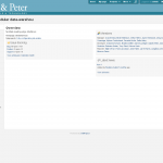
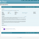
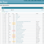
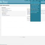
Today I was able to finish porting over most of the custom Shane & Peter theme to ChiliProject. This theme will become the default for ChiliProject 3.0.0 and make it a lot easier to change the user interface to bring it into Web 2.0 (and maybe Web 3.0 later on).
I’ve included screenshots of how things look now. The colors and Shane & Peter branding will be changed in the final version, this is just the version that barely boots and runs.
I’d also appreciate if you could help out with the new design. Right now I need some help decided what user interfaces and features to finish porting over and in a few weeks I’m going to need some major help to clean up our CSS files. If you’d like to contribute, even a few minutes to give us feedback, post a comment below or on the ChiliProject issue. Thanks.


New design seems nice but I do not like color personally – I would say it is too faint. I think it could look more friendly as well as professional if there was more black with green or black with blue. Take a look at Red-Andy redmine theme http://www.redmine.org/projects/redmine/wiki/ThemeRedAndy or even latest google search default search page.
I haven’t finished with the design, those are Shane and Peter’s colors so I’m using them for now. I’d like to release this with a few different color options: white, black, green, blue, etc. If you’re interested, I’d love to have some help creating the themes.
Great Jobs.
I used redmine 1.3.X, Could the theme package support Redmine?
Not easily. It’s a major change to the layout and CSS so it isn’t really easy to keep separate.
The design is based on the Shane & Peter design plugin, which has been used on Redmine for a few years now. I don’t provide any support for it but you might be able to use it if you want a similar design.
https://github.com/edavis10/redmine_shane_and_peter_design